

A box full of small, scrunched up pieces of paper was being shared around the room. Each student was asked to pick one. ‘What d’ya get?’ echoed around the room.
I looked down, and slowly unfolded my piece of paper. There was one word typed on it. ‘Bodoni’
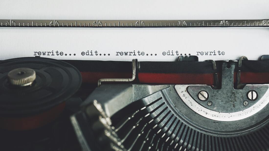
The above event took place during a graphic design course at the Dublin Institute of Design. This assignment was to learn about a particular font or typeface, and to design a poster to showcase and promote the unique characteristics of that typeface. When I reflect on the work I undertook, I can see it really did follow a design process which in the end yielded an output I was proud of. Since the course, I have used this process across various initiatives, even outside of graphic design. Filled with reflection, creativity, feedback, action and experimentation, below you can see the flow of events in this particular example, as well as some images from the various stages to see the development (just click to enlarge any of the images).
Before I outline my process and examples from each stage, I wanted you to firstly realise you have already encountered the Bodoni font! Think of how ‘Nirvana’ appears on their albums, how ‘Vogue’ appears on the top of a magazine cover, or the ‘cK’ of Calvin Klein. Bodoni is a font used quite broadly, and familiar to many already.
Step 3 - Mindmap Generation
Step 4 - Initial Sketches
Step 5 - Exemplars
It’s good to be aware of the typeface ‘in action’, in society. Looking through examples and indeed the various typeface letters/alphabet in a bit more detail at this stage can assist when you are looking back over what came from your early creations.
Step 6 - Revisit Sketches, Concepts & Shortlist
Step 7 - Bring a Selection of Sketches to be Mocked Up Using Software
Step 8 - Get it Down to Final Designs - and Experiment
Step 9 - Feedback & Action
Step 10 - Final Version - Presentation & Reflection
|
 I learned something new this week! For context - I had a PDF where I needed to fix an error/typo but didn't have access to the editable word document version. There are numerous PDF editors on various online platforms, but I was keen to use Adobe Acrobat (I'm a big fan of Adobe's suite and its various capabilities - if you're in education, there are discounts available on the creative cloud suite of apps). Hence, I opened Adobe Acrobat, went to 'Tools', and 'Edit PDF' on the menubar and opened the PDF file I wanted to work on. I went to the typo, tried to delete and add in some next text.....but it didn't seem to work - it looked awful! What appeared initially as a quick fix, actually needed some more work/learning. So what's the secret - well here it is - the font for the new text, or for any of the edit, has to be the same as in the source document. Solution? Easy. Go to the font list and select what you need - but in many cases - the one you need is not listed as an option - it's listed at the bottom of the scroll of fonts, greyed out. Another roadblock encountered. However, there is a workaround....and below outlines how to get it finalised......
Just one thing to be mindful of is the licensing around certain fonts you may come across elsewhere, outside of Adobe – for example, you may require a Google font that is present in the source PDF you wish to edit, so may need to check licences etc. to ensure you can use it accordingly.
|

Ronan BreeEducation Developer,Science Lecturer, Archives
March 2023
Categories
All

Any opinions expressed here represent my own and not those of my employer.
|


 RSS Feed
